Ohzio App
UX + UI
March 2020
About the project
Ohzio is a dynamic app for small and medium sized establishments, in which weekly draws are held where they give away the most attractive experiences and activities of the community. When users make purchases, they accumulate participations for the different raffles that take place in the different associated business.
This application also offers exclusive promotions in the different establishments and a loyalty card that offers a series of advantages for the user such as offers and discounts.
This application has two roles: company manager or user. The main difference between both is the possibility of creating and editing draws, promotions or offers. In addition, the manager has a section to scan the QR codes of the users so that they can obtain the participation to the raffles of their business.
My role
The main objective was to restructure the information of the application, unifying the most relevant information in different related sections, eliminating irrelevant information, in order to create a simple and intuitive experience.
It also had to redesign the user interface to create a friendly, uniform, clear and simple interface, so that the application would be accessible to all types of end users regardless of their digital knowledge.
Tools
Paper, pencil, Sketch and Zeplin.
Process of design
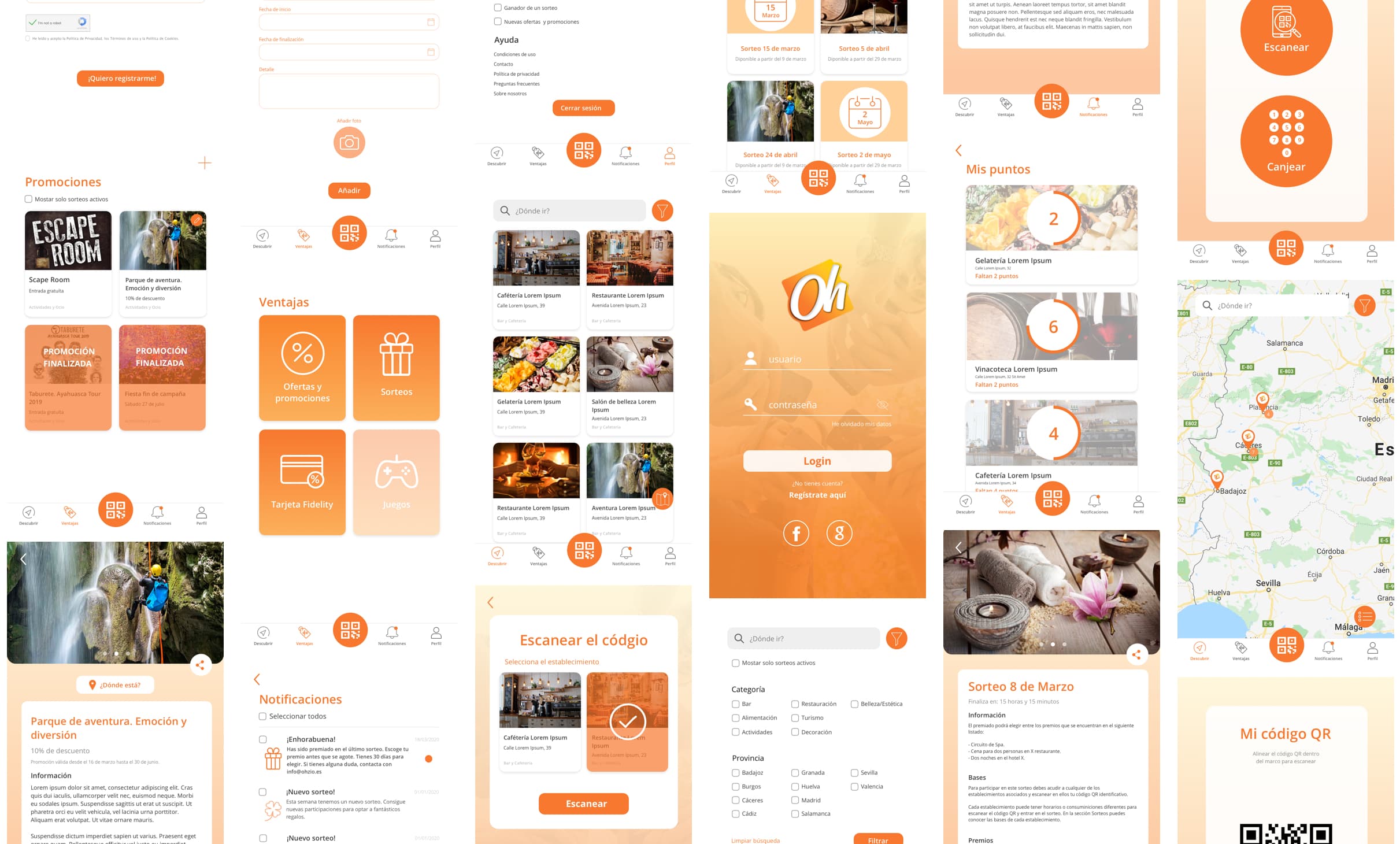
Initially I focused on knowing the application in detail and the flow to perform the different functionalities. I tried to eliminate information and elements that did not provide information or relevance to the user, thus avoiding possible distractions and confusion during their experience with the application.
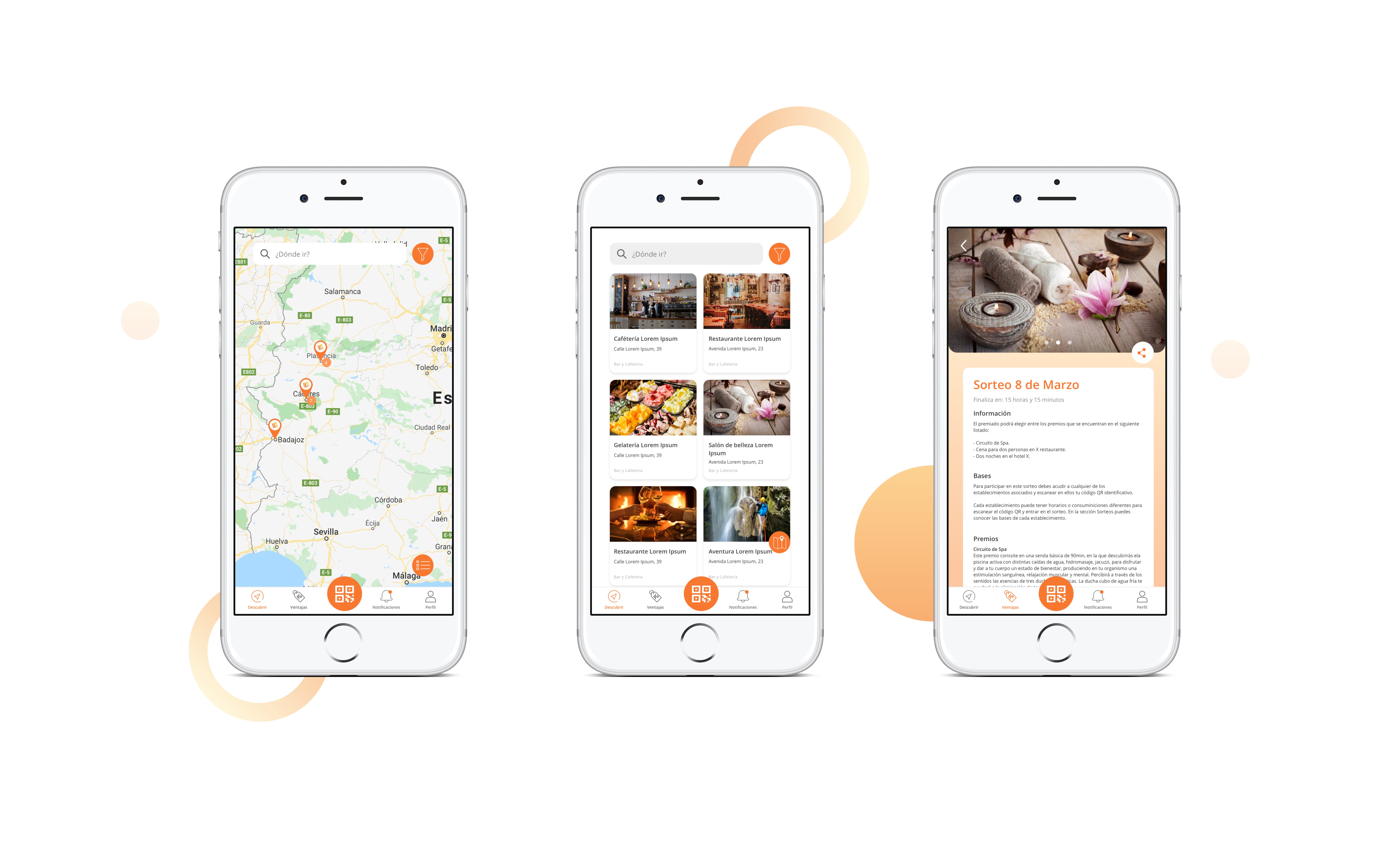
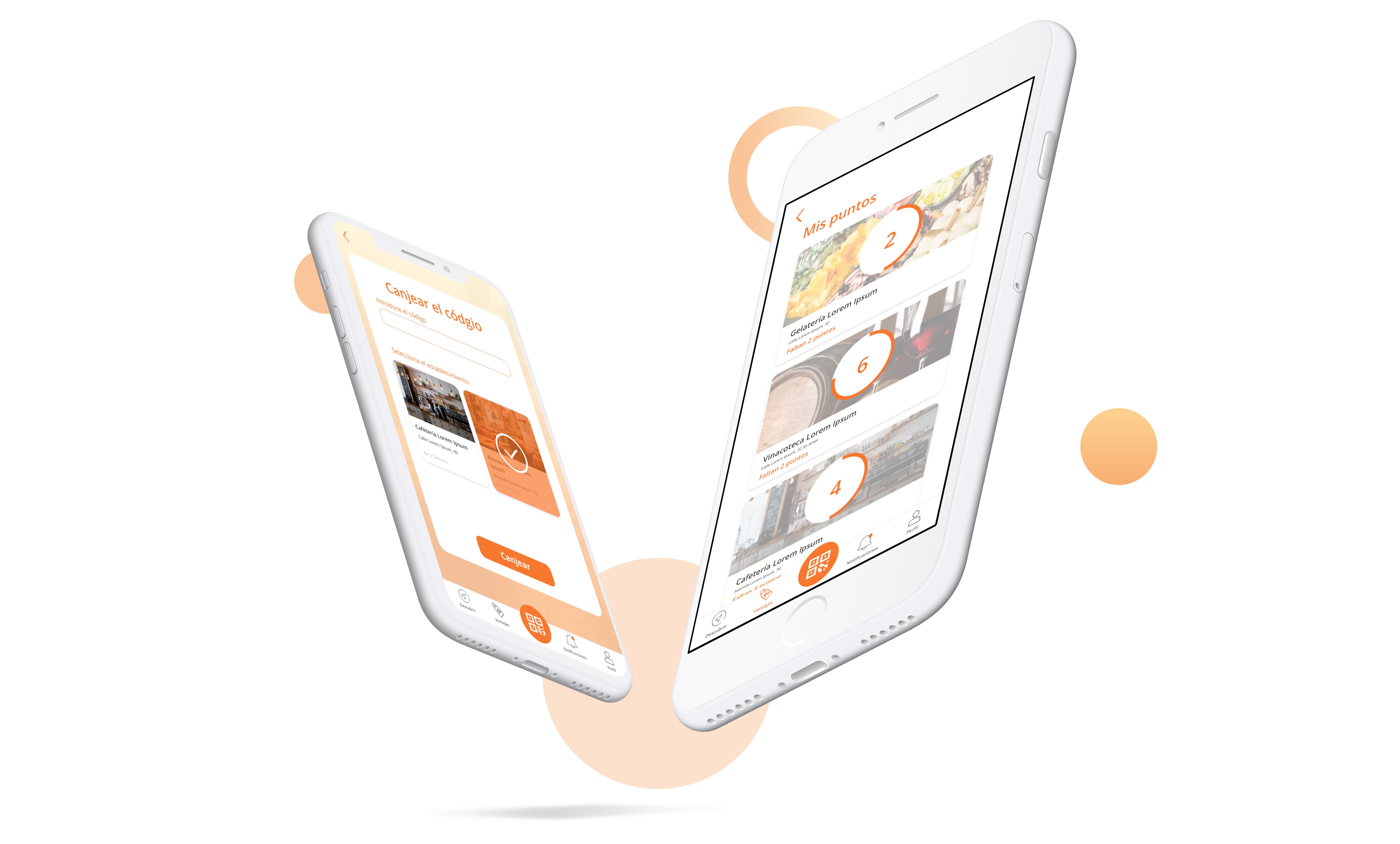
I structured the sections in such a way that in each one of them, the user could obtain the information they requested in a simple way. The access to the QR code, the most used element of the application, would be in the central part of the navigation bar easily accessible from any point of the application and the rest of the informative sections like notifications, raffles, promotions and profile management are also accessible through the navigation bar in a less priority way.
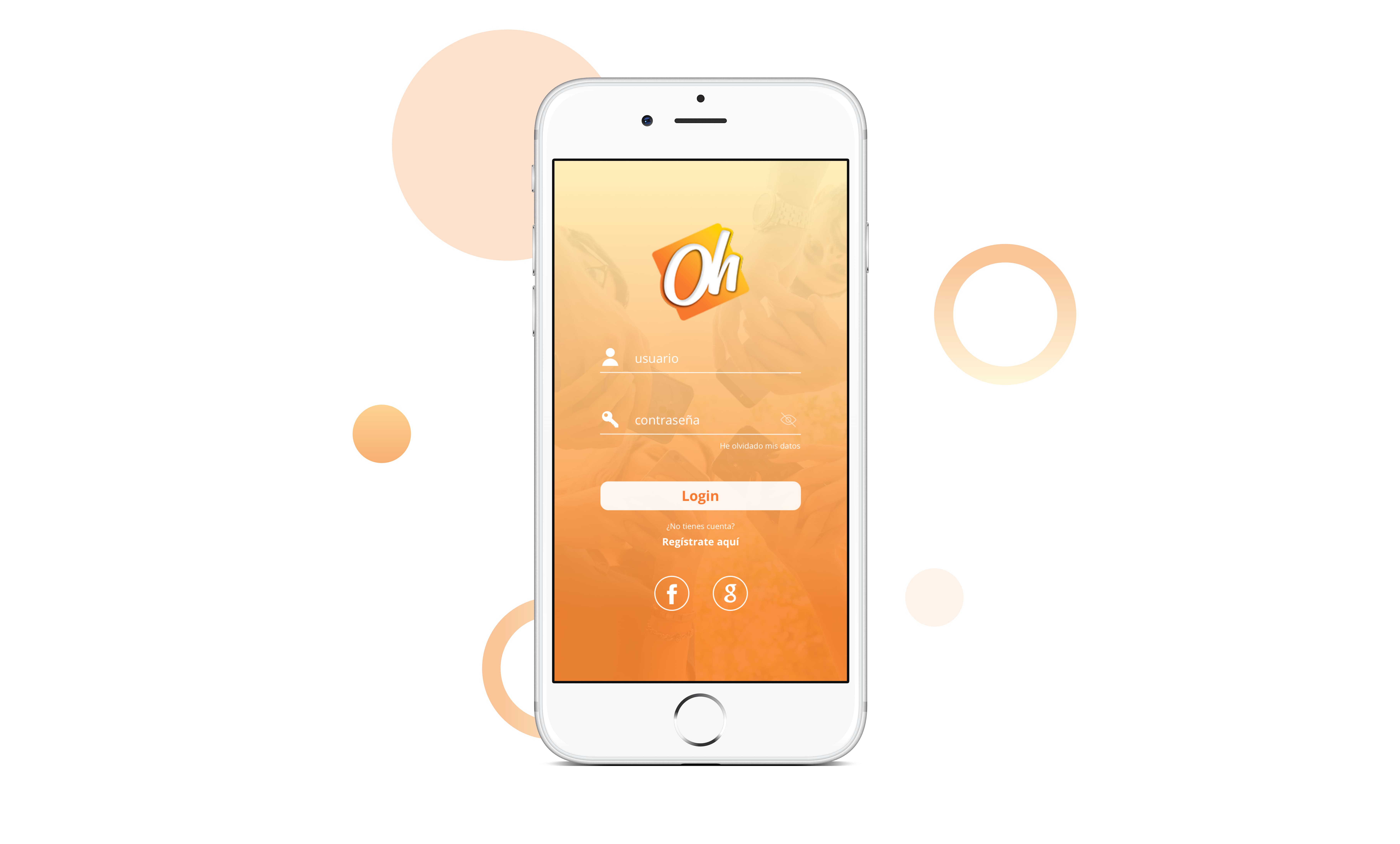
Regarding the interface, the aim was to create a friendly and simple design, where white predominates as the main colour and orange as a secondary colour, which represents and identifies the brand.


